DC Logo Review
February 2, 2012
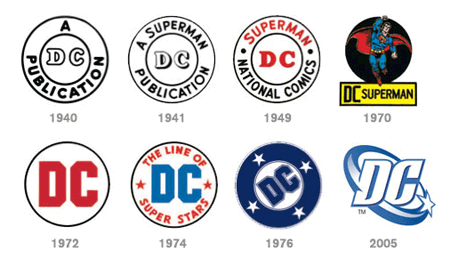
Earlier this month publishing titan DC comics unveiled their new logo. Whipped together by the folks at the design firm Lando, it's quite a departure from previous efforts. Here's the official press release. I was a fan of the 2005 effort, which really grew on me. The new logo is not Super:
The Good - Simple design.
- The literal representation of an under-cover secret identity type thing is clever enough.
- Looks terrific in the upper left corner of the funny books, resting directly against the spine.
The Bad- The letter "D" is almost invisible.
- The curl effect, in this and any application, is a little played out.
- The new deal completely lacks any sense of the heroic - a quality we've enjoyed since '76 (the star, the sense of motion, bold lettering, etc).
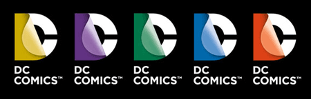
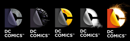
The Ugly- As seen below, the logo can appear in various colors, revealing fancy doo-dads and what all. The potential for dumb is high. Case in point: the Watchmen version. Absolutely painful.
|